Colour Musings

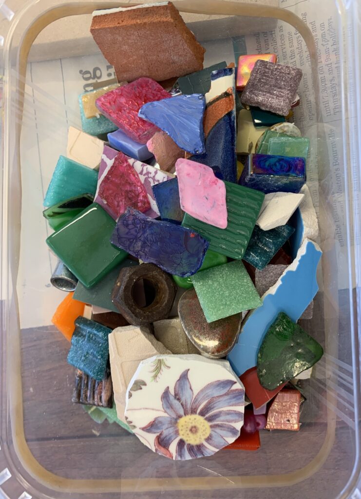
I have been spending some time musing about Colour. I was inspired to do this by a student on a course I taught last year. This particular student was interested in using tesserae to play with colour combinations. Whereas the other students created small mosaic pictures, she created a colour wheel which incorporated different colours and textures. She used lots of found materials including buttons, and bits of rusted metal hardware found in the street. She used pieces of crash glass and painted the backs of them with acrylic paint. She asked me lots of questions about colour and this got me enthused to go and find out a lot more.
I have had somewhat of a resistance towards reading colour theory as previous research has often led up blind alleys about colour temperature: for example statements such as “Blue is cold and Orange is warm” and “Red makes you feel angry” and “Green is the colour of money and therefore a successful colour.” I wanted to find something that could properly help me understand how colour can affect the design of a mosaic.
After some searches I came across a book by Albers Josef called Interaction of Colour. I can thoroughly recommmend this book to anyone who is interested in having a more in depth understanding of colour. It is quite heavy going and you have to think hard but it will completely revolutionise you ideas about colour. He makes the point that most people do not get beyond the naming of colours that we learnt when we are children. And this was certainly the case with me.
“The nomenclature of color is most inadequate. Though there are innumerable colors – shades and tones – in daily vocabulary, there are only about 30 color names.”
It is difficult to summarise the book, but the main point is that colour is always relative to the situation in which it is found. The book goes on to give examples, using scraps of coloured paper placed beside each other and in different proportion to each other.
This has particular relevance to the art of mosaics, as how colours are used strongly effect not only the design of the piece, but also how the viewer perceives the piece. There is not only the tesserae to consider but also the grout or the adhesive cement or the background of the piece if there is one.
While we have a couple of months of summer left I am going to be experimenting with using different shades and hues of adhesive cement.
Tags: colour theory

